
JAY
Concept Brand Identity
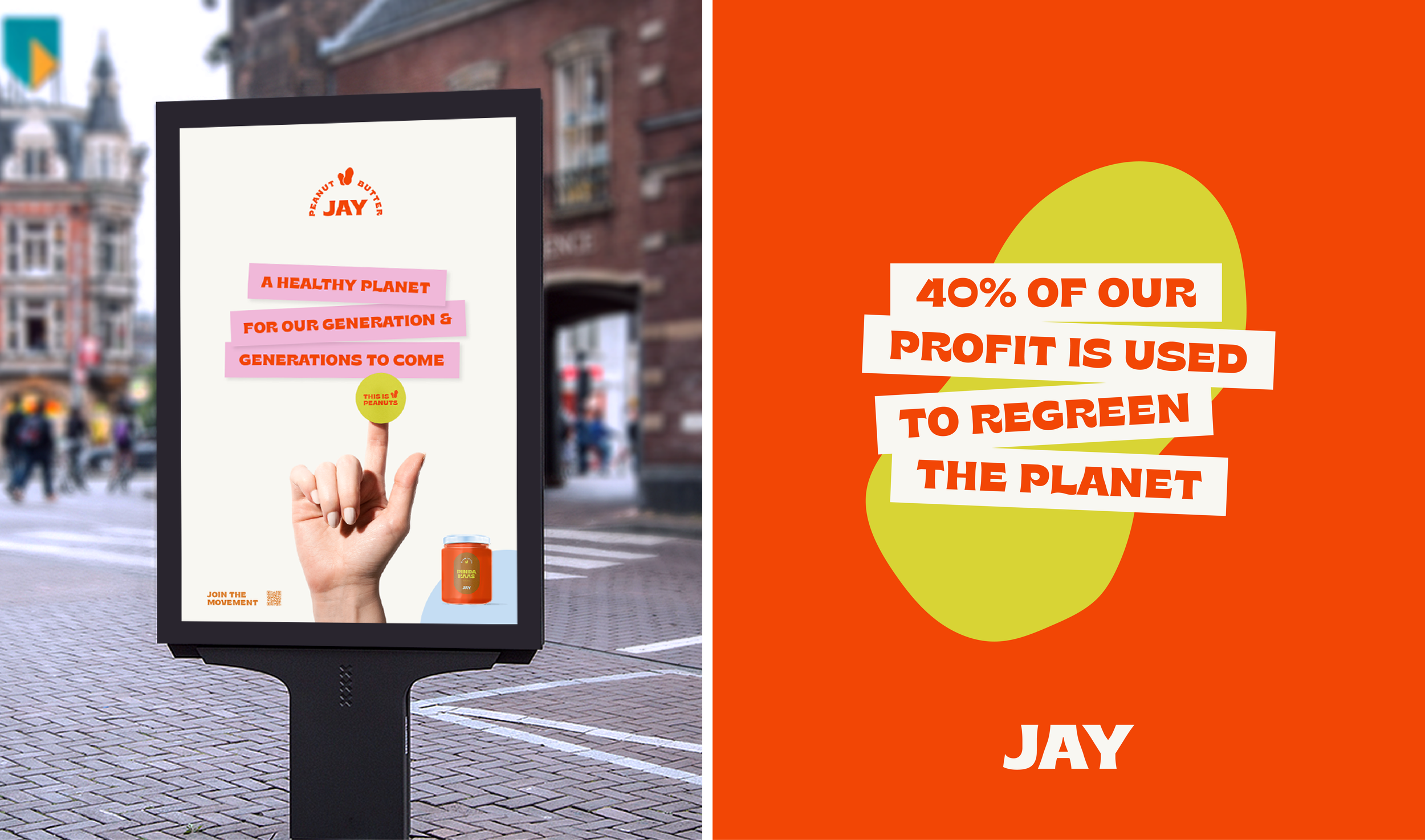
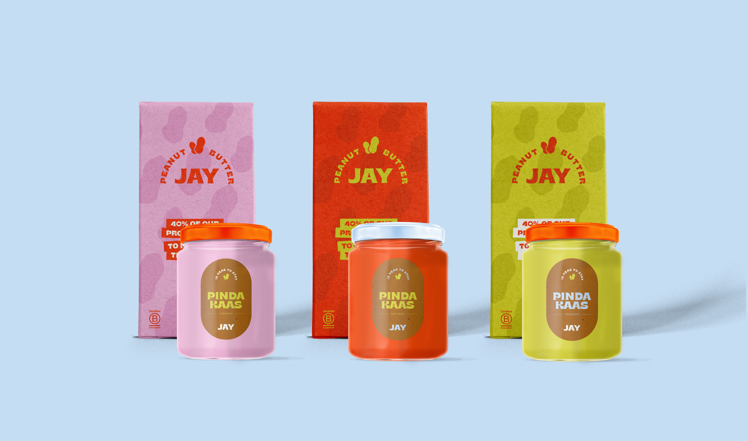
Peanut butter. A hero that fits so many recipes. But this is not just a normal peanut butter; JAY stand for honest & fair peanut butter that aims to re-green the planet, so our generation and the generations to come can enjoy the products Mother Earth gives us.
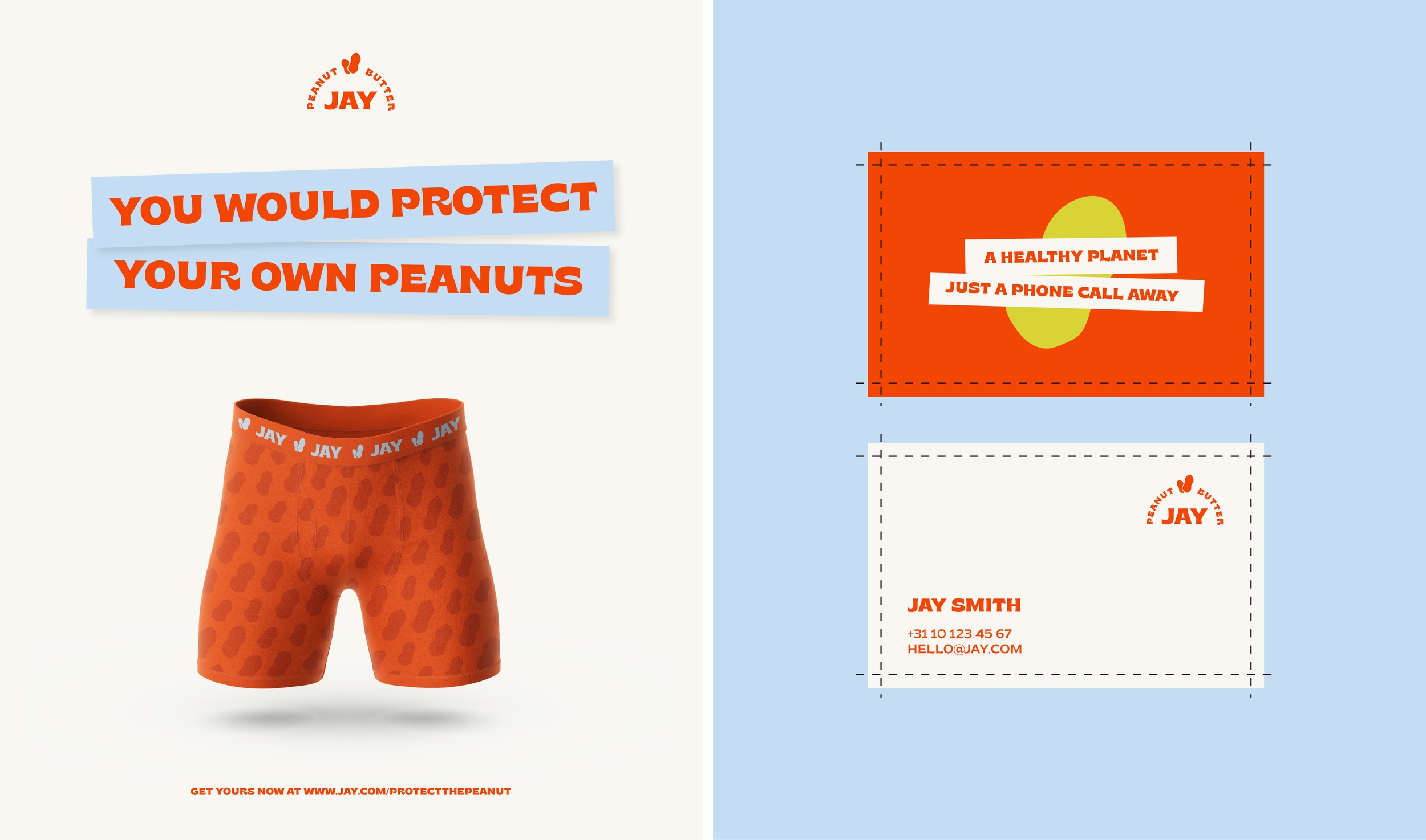
JAY isn’t afraid to trigger people and that’s implemented into the visual identity. With its bold colours and shapes, JAY is sending a message. JAY is meant to be seen and wants to gather a following as much as possible.
JAY is here to stay.